3 Basics of HR Dashboards
A Dashboard is a visual representation of data that is used to monitor, analyze, and report on key metrics in a simple and interactive way. It aggregates and displays important information in real-time, allowing decision-makers to assess business performance at a glance. Dashboards provide quick access to essential data, enabling users to make data-driven decisions based on actionable insights.
In the context of HR, dashboards serve as powerful tools to track workforce metrics, monitor HR processes, and visualize employee-related data, helping HR professionals to better manage and optimize their human resources.
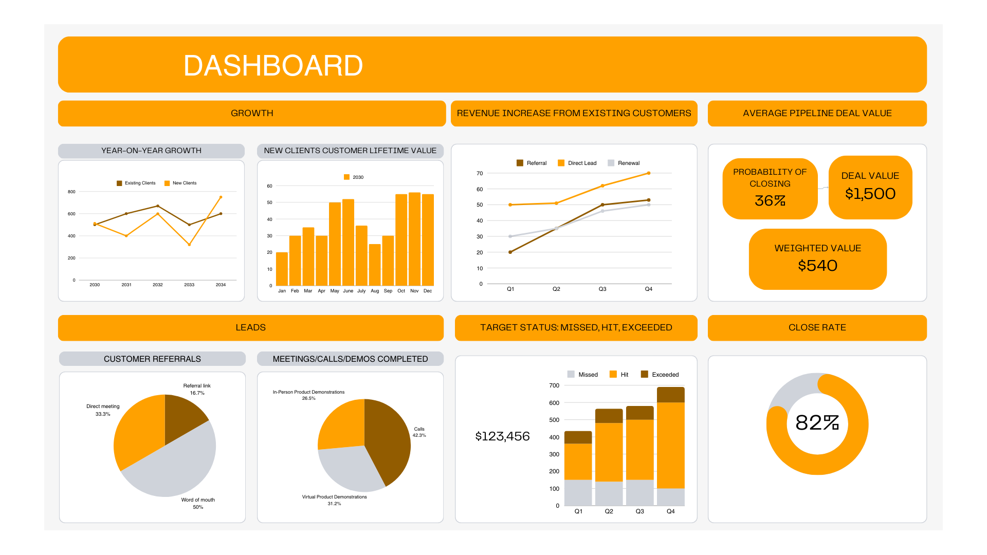
Sample Dashboard
3.1 Purpose of HR Dashboards
HR dashboards are powerful tools used to visually track, analyze, and display key HR metrics and performance indicators. These dashboards provide HR managers and decision-makers with a quick overview of essential workforce data, enabling them to make informed decisions. The primary purpose of an HR dashboard is to:
- Monitor HR Metrics: Track key metrics such as recruitment, turnover, employee performance, and training effectiveness.
- Provide Insights: Convert raw data into actionable insights that help HR professionals improve operational efficiency.
- Track Progress: Compare actual HR performance against set goals and benchmarks.
- Drive Data-Driven Decisions: Empower HR teams to make informed decisions based on the data presented in the dashboard.
3.1.1 Components of HR Dashboards
An HR dashboard typically consists of several components that work together to present a comprehensive view of HR activities:
- Key Metrics: Metrics such as turnover rate, time to fill, absenteeism rate, training completion, and employee satisfaction.
- Visualizations: Graphical representations of data such as bar charts, pie charts, line charts, and gauges that help users interpret the data easily.
- Data Sources: The raw data that feeds into the dashboard, usually collected from HR management systems, surveys, and other relevant sources.
- Filters and Slicers: Allow users to drill down into specific data by applying filters, such as time periods, departments, job titles, or employee groups.
- Trends and Benchmarks: Comparison of current data against historical data or industry benchmarks to identify trends and areas that need attention.
3.2 Types of HR Dashboards
HR dashboards can be categorized into several types based on the specific needs of the organization and the audience. The main types include:
-
Operational Dashboards:
- These dashboards focus on the day-to-day operations of HR. They display real-time data related to tasks such as recruitment, onboarding, absenteeism, and employee queries.
- Example: A dashboard showing the number of new hires in a week or the number of employees absent on a particular day.
-
Strategic Dashboards:
- Designed for long-term decision-making, strategic dashboards focus on key metrics that align with the organization’s overall objectives. They provide insights into workforce trends, talent development, and retention strategies.
- Example: A dashboard showing the turnover rate over the past year, tracking hiring trends, or monitoring diversity in hiring.
-
Analytical Dashboards:
- These dashboards are used to analyze data in-depth, providing insights into patterns and correlations. They are designed for HR professionals who need to understand the underlying factors that affect employee performance, turnover, and other HR metrics.
- Example: A dashboard analyzing the relationship between training completion and employee retention.
-
Tactical Dashboards:
- These dashboards are typically used for reporting and tracking key metrics on a monthly or quarterly basis. They provide mid-level managers with actionable insights to make adjustments to HR practices.
- Example: A dashboard tracking the progress of recruitment against target numbers for a particular department or role.
3.3 Hands-on Exercise: Designing a Simple HR Dashboard in Excel
In this exercise, you will learn how to design a basic HR dashboard in Excel. The dashboard will focus on key metrics such as time to fill, turnover rate, and employee satisfaction, providing a visual summary of HR performance.
Steps: 1. Prepare the Data: - Create or import a simple dataset that includes employee details, recruitment data, and performance metrics. Ensure that your data is well-organized and includes columns for key information (e.g., employee ID, department, date of hire, turnover status, etc.).
-
Create a Pivot Table:
- Use a Pivot Table to summarize the data. For example, you can calculate the average time to fill positions, total turnover rate, or training completion rates by department.
-
Add Visualizations:
- Once the Pivot Table is set up, create charts to represent the data visually. Use bar charts, pie charts, and line charts to display key metrics.
- Example: A bar chart showing the number of hires per department or a pie chart displaying the turnover rate by gender.
-
Apply Filters:
- Use slicers to allow the user to filter the dashboard by department, date, or other relevant categories. This enables users to drill down into specific areas of the data.
-
Refine the Design:
- Make your dashboard visually appealing by adjusting the layout, adding colors, and formatting the charts and tables. Ensure that the most important metrics are highlighted and easy to read.
-
Review and Save:
- Once the dashboard is complete, review the data to ensure accuracy and consistency. Save your Excel file and update it regularly with fresh data to maintain the dashboard’s effectiveness.