4 Dynamic Dashboards with Filters
Dynamic dashboards are interactive data visualizations that allow users to filter and explore data in real-time. By adding filters and slicers, users can control which data is displayed on the dashboard, making it more interactive and tailored to their specific needs. This feature is particularly useful in HR dashboards as it allows users to analyze data based on different criteria such as departments, years of service, gender, or job roles.
4.1 Adding Interactivity with Slicers and Filters
Slicers and filters are essential tools for making dashboards dynamic. These tools allow users to drill down into specific subsets of data and see only the information that is relevant to them. The key benefits of adding slicers and filters to your HR dashboard include:
- User Control: Slicers and filters give users the ability to select the data they want to see, making the dashboard more customized and relevant to their needs.
- Data Exploration: With interactive filters, users can explore trends, compare different data points, and discover patterns that might not be immediately obvious in static data.
- Enhanced Decision Making: By narrowing down the data to specific categories (e.g., a particular department or time period), users can make more informed, data-driven decisions.
4.2 Types of Filters and Slicers
-
Dropdown Filters: These filters allow users to select a specific value from a list of options. They are ideal for categories with a finite number of options, such as department names or job titles.
- Example: A filter that allows users to view data for a specific department (e.g., HR, IT, Sales).
-
Date Filters: These filters allow users to select a time period for analysis, such as filtering by month, quarter, or year. Date filters are useful for tracking trends over time.
- Example: A filter that allows users to view recruitment data from the last quarter.
-
Slicers: Slicers are graphical elements that can be added to a dashboard to provide easy-to-use, button-like controls for filtering data. Slicers allow users to filter the data by multiple categories at once, such as gender, job title, and department.
- Example: A slicer that filters employee performance data by gender and job role.
-
Multi-Selection Filters: These allow users to select multiple values at once from a list. This is useful when you want to compare several categories or data points in the dashboard.
- Example: A filter where users can select multiple years of joining to analyze trends over several years.
4.3 Benefits of Dynamic Dashboards with Filters
- Enhanced User Experience: Filters and slicers make dashboards more intuitive and user-friendly by providing an easy way to manipulate and interact with the data.
- Time-Saving: Instead of manually adjusting the dataset each time a new question arises, filters allow users to quickly adjust and focus on specific areas of interest.
- Real-Time Analysis: With interactive elements, users can see changes to the dashboard instantly, making it a powerful tool for real-time data analysis and decision-making.
4.4 Hands-on Exercise: Interactive Dashboards in Excel
In this exercise, you will learn how to create an interactive HR dashboard in Excel using slicers and filters. This exercise will help you practice applying interactivity to your dashboards and will improve your ability to design dynamic HR dashboards for various stakeholders.
Steps: 1. Prepare the Data: - Ensure that your HR data is structured in a table format with clearly defined columns, such as employee ID, department, job title, date of hire, performance scores, etc.
-
Create Pivot Table:
- Use a Pivot Table to summarize key HR metrics, such as employee performance, turnover rate, and time to fill. For example, create a Pivot Table to calculate the average performance score by department.
-
Add Slicers:
- After creating the Pivot Table, add slicers to make the data interactive. To do this:
- Select the Pivot Table.
- Go to the “Insert” tab and click “Slicer.”
- Choose the fields you want to filter by (e.g., department, job title, or year of joining).
- Add multiple slicers to allow users to filter data by multiple categories.
- After creating the Pivot Table, add slicers to make the data interactive. To do this:
-
Add Filters:
- You can also add dropdown filters to the dashboard by using the “Data Validation” feature in Excel. For example, create a dropdown filter to select data by year or employee status (active vs. exited).
- To add a dropdown filter:
- Select a cell where you want the filter.
- Go to “Data” > “Data Validation” > “List” and choose the options you want to display in the dropdown.
-
Design the Dashboard:
- Arrange the Pivot Table, slicers, and charts on the same sheet to create a cohesive and user-friendly HR dashboard. You can use various chart types (bar, line, pie) to visualize key HR metrics.
- Use conditional formatting to highlight important trends, such as departments with high turnover rates or employees with outstanding performance.
-
Review and Save:
- Once the interactive dashboard is complete, review it to ensure that the slicers and filters are working correctly. Save your Excel file and update it regularly with fresh data to keep the dashboard accurate and relevant.
4.5 Assignment-2: HR Dashboard Creation using Excel
4.5.1 Objective
To use the self-generated HR dataset from Assignment 1 to create meaningful visualizations and dashboards, enhancing your understanding of HR metrics and their application in decision-making.
Instructions
-
Dataset Validation:
- Review your randomly generated dataset to ensure it includes accurate and realistic data for all required columns:
- Job Posting Date, Hire Date, Join Date, Exit Date, Department, Job Title, Recruitment Cost, Gender, Absentee Days, and Training Completion Status.
- Review your randomly generated dataset to ensure it includes accurate and realistic data for all required columns:
-
Metrics Calculation:
- Ensure you have calculated the 12 HR metrics as discussed in class, including Time-to-Onboard, Total Tenure, Recruitment Cycle Time, Turnover Cost Estimate, and others.
-
Visualization Tasks:
- Answer the following questions by creating visualizations using your dataset in Excel.
- Use appropriate chart types and formatting for clarity and professionalism.
4.5.2 Questions and Tasks
Section 1: Recruitment Metrics
-
Time-to-Onboard:
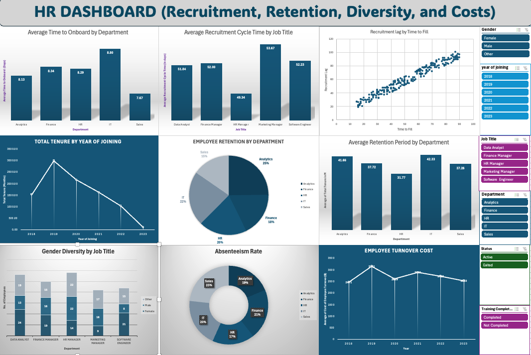
- Create a bar chart showing the average time-to-onboard for each department.
- Highlight which department integrates new hires fastest.
-
Recruitment Cycle Time:
- Visualize the recruitment cycle time using a column chart grouped by job title.
- Identify roles with the longest and shortest recruitment cycle times.
- Recruitment Lag vs. Time to Fill:
- Create a scatter plot showing the relationship between Recruitment Lag and Time to Fill.
- Create a regular chart directly from the raw data by selecting the relevant columns (e.g., Recruitment Lag and Time to Fill) and inserting the desired chart.
Section 2: Retention and Tenure Metrics
-
Total Tenure:
- Use a line chart to visualize total tenure across employees grouped by year of joining.
- Analyze trends over time.
-
Employee Retention :
- Create a pie chart showing retention of employees in different departments.
-
Retention by Department:
- Create a bar chart that visualizes the average retention period for employees in each department.
Section 3: Diversity and Attendance Metrics
-
Gender Diversity Rate:
- Create a stacked column chart showing gender diversity by department.
- Highlight departments with the highest and lowest gender representation.
-
Absenteeism Rate:
- Use a line chart to track absenteeism rates by month.
- Apply conditional formatting to highlight months with rates exceeding 10%.
Section 4: Cost and Stability Metrics
-
Turnover Cost Estimate:
- Create a clustered bar chart showing turnover costs for each department.
- Identify the most costly department in terms of turnover.
-
Workforce Stability Index:
- Visualize the workforce stability index using a stacked bar chart, categorized by departments.
- Add slicers for year and gender for interactivity.
Section 5: Dashboards
-
Recruitment and Retention Dashboard:
- Combine visualizations for time-to-onboard, recruitment cycle time, and retention period into a single dashboard.
- Add slicers for interactivity (e.g., filter by department, year).
-
Diversity and Cost Analysis Dashboard:
- Include visualizations for gender diversity rate, absenteeism rate, and turnover cost estimate.
- Add a summary table highlighting key insights.
Submission Instructions
Save the file as RollNo_HRMD_Assignment2.xlsx (Ex: 416_HRMD_Assignment2.xlsx).
-
Submit the following:
- An Excel file containing:
- Calculated metrics.
- Visualizations for each question.
- A Word/PDF document describing:
- Insights derived from the visualizations and dashboards.
- Challenges faced during the creation process.
- An Excel file containing:
Additional Notes
- Ensure all charts have proper titles, labels, and legends.
- Use slicers and filters for interactivity.
- Focus on clear and professional presentation.
- You may refer to class discussions and materials for guidance.